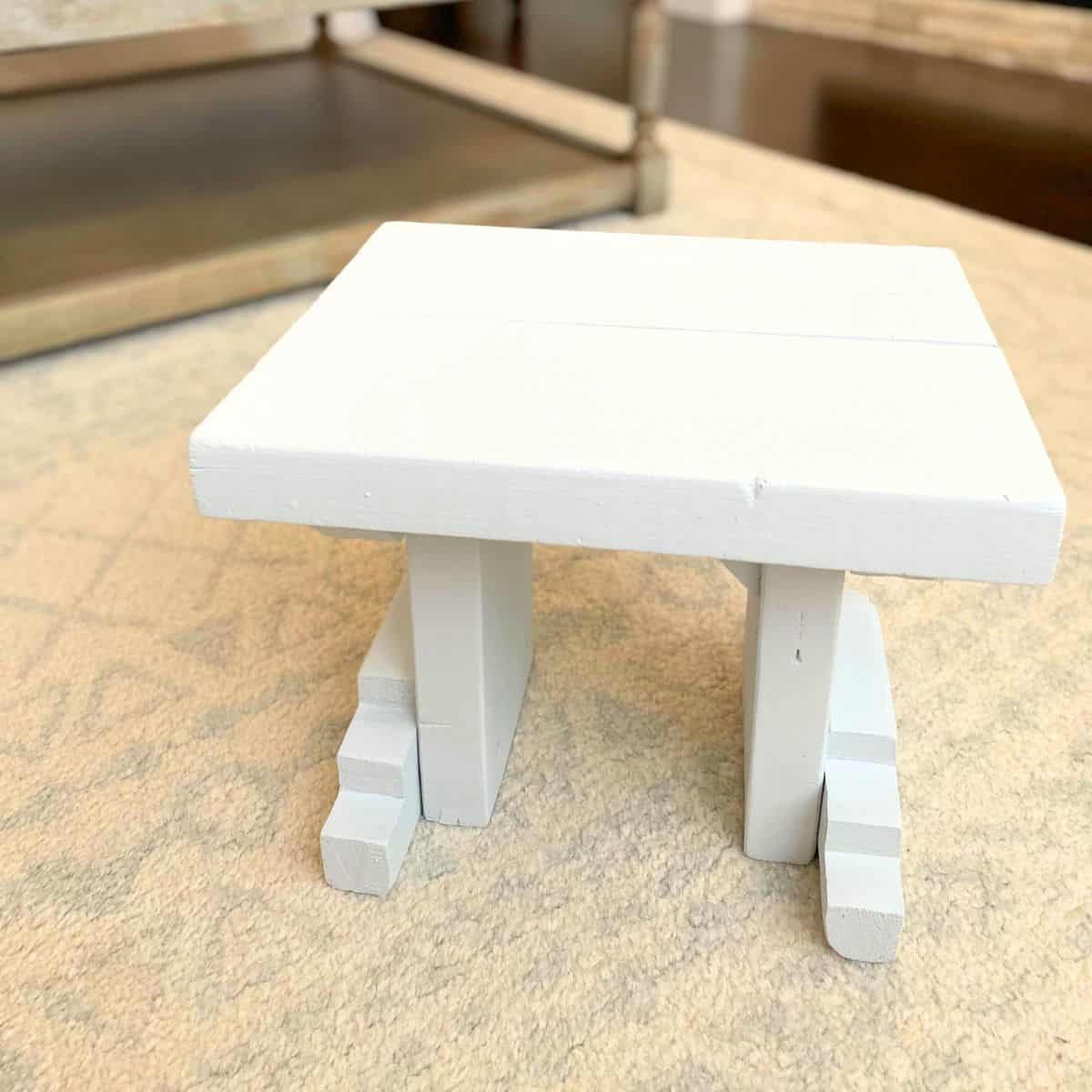
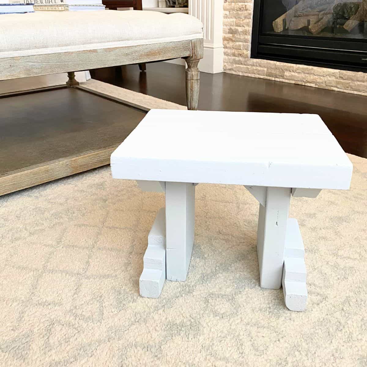
It's truly amazing that this little step stool DIY makeover came together flawlessly with just paint.
What once was old, dirty, chipping white paint was completely transformed with a classic soft gray from the eponymous Benjamin Moore paint company.
With all the before and after photos you need to see to believe, don't miss all the details of how Benjamin Moore Feather Gray (2127-60) turned a thrifted wood step stool into a cute kitchen accent in a few short hours.
Some time ago, I wrote Tips to Get Home Decor on a Budget, which you should also read, where I talked at length about how indispensable antique/vintage/thrift stores are for finding unique, one-of-a-kind home decor.
This is one of those stories.
Thrifted Step Stool
We have a tall pantry-the same 10 feet in height as all the ceilings on our main level-in our kitchen. In order for me to reach things on the top shelf, I needed a step stool. Honestly, I wasn't even looking for one at the time.
On a random visit to a well-known local antique/vintage mart, I came across a slightly dilapidated step stool. It was white, with paint chipping everywhere. But it was supposed to look like that, since it was in a vintage shop.
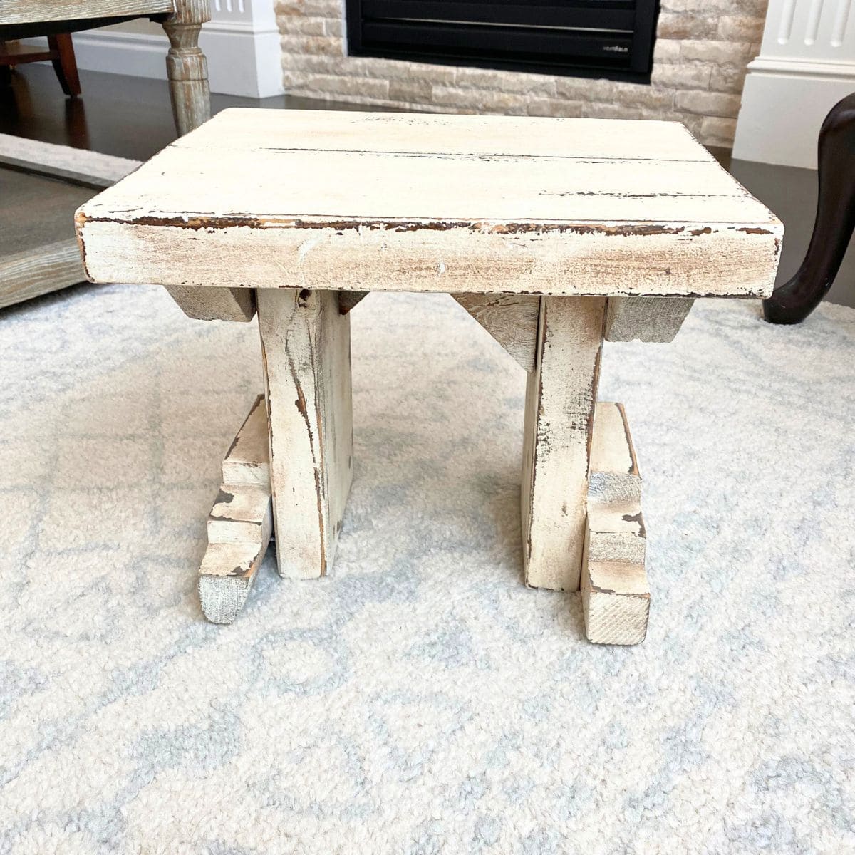
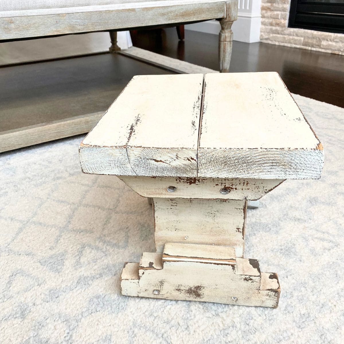
Most people would use it as-is as decor, but I had a better idea for our home. I immediately wanted to paint it to use as a step stool in our kitchen!
For me, I like to visualize what things could be, even random pieces of decor. It's kind of like daydreaming, in a way. It also happens when I walk into a room for the first time. Call it the interior design enthusiast in me showing.
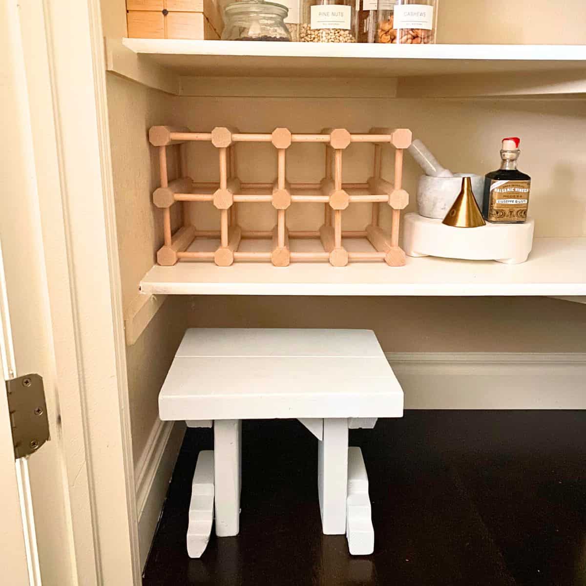
The little step stool was cute and different, and I could see how a nice soft blue-gray paint could give it a whole new life!
How to Choose Decor for Easy DIYs
Not all vintage/thrifted pieces are easy to DIY or makeover.
When I am out and about looking for those vintage, one-of-a-kind home decor pieces, there are many factors that go through my mind.
Tips for how to choose decor that is easy to diy or makeover:
- Age/Year - Whether by finding the year/age markings on the piece or by asking the vendor, you need to determine what year the item was made. What you want to know is, is it old enough to be categorized as antique, which is 100 years or more, as Veranda discussed in their article on classifying antiques, is it vintage or is it new-ish. For good reason, I don't alter antiques. Vintage items are a different category that I consider on a case-by-case basis. Use your best judgment when you want to DIY something antique or vintage.
- Cost to Repair - If you need to make repairs in some way, if the cost to repair is significantly more than buying something similar but new, consider whether it's worth it to begin with. For unique finds that decision is easier because chances are there is nothing like it on the market; that's probably why you like it. In the end, it comes down to how much money you want to sink into the piece to make it over how you want it.
- Time - You may find a piece, estimating it will take three hours to makeover when in reality it will actually take three days. Be realistic about how much time it will take to complete the project. If it's more time than you're willing to commit, don't buy the piece unless you also like it as-is. Otherwise, you'll regret the purchase.
- Details - You should also take into account any details or intricacies inherent in the piece. The more detailing (i.e., nooks, crannies, moldings), the more materials, time and labor it will take to complete the makeover to your satisfaction. Do you have the proper tools and techniques to finish it? Know this before you begin.
As you can see, our step stool has quite a bit of detail, but it worked out.
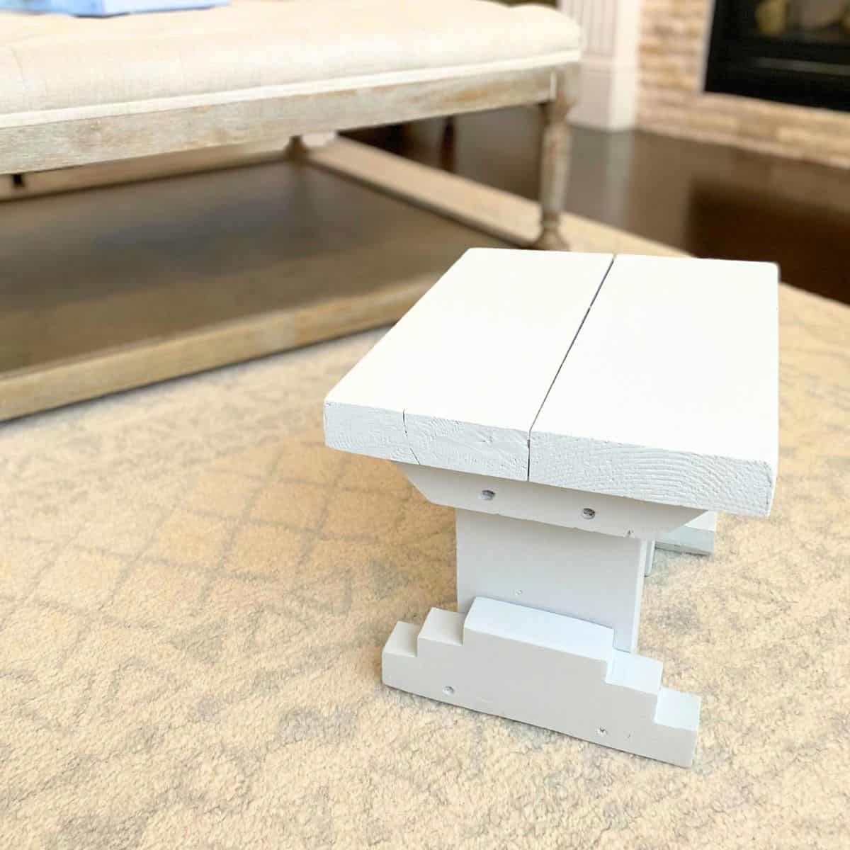
A Soft Gray Paint - Benjamin Moore Feather Gray
In my limited experience with DIY projects that involve painting, choosing a paint color is the most difficult decision to make.
You may think that is absurd, to which I say, try it. Go to a paint store and try to pick out the perfect shade of white.
First, you need to choose a brand from among at least half a dozen at any given paint store (and more online). Then you need to decide the feel you want-warm, cool, neutral. After that it's all about comparing the seemingly endless array of swatches, pick them out, take them home to see what they actually look like, return to the store to get samples, or order reusable samples from Samplize (recommended), and then compare at home until you feel that you have the perfect color.
See what I mean?
Important:
It is critical to take the time to test out paint in your own home. The exact same color paint looks different in every store, across every room and on every computer screen. Do not simply pick out a paint swatch card without also taking it home to view it in your space. I assure you it will look different.
Luckily for me I knew I wanted to use a gray that had blue, maybe some green, undertones but one that wasn't too cool. Benjamin Moore Feather Gray (2127-60) was the perfect shade for this project!

Feather Gray is a sophisticatedly cool, soft mid-tone gray depending on lighting. Interestingly, it has blue-green even purple undertones but does not feel overly cool to me like the undertones would suggest.
I would say Feather Gray is a bit of a chameleon, but I've come to accept that is true of all paint colors because it greatly depends on factors outside of your control. Namely, lighting and light sources.
You can see Feather Gray used in a coastal home bedroom by designer Andrew Howard. Mixed among shades of coral and crisp white, Feather Gray is calming and feels right at home.
Beautiful Gray Paints with Blue-Green Undertones
If I were to do this project today, I may choose paint leaning even more pronunced green undertones, such as Benjamin Moore Boothbay Gray (HC-165), Mount Saint Anne (1565) or Piedmont Gray (CC-690) which is now called Greyhound (1579).
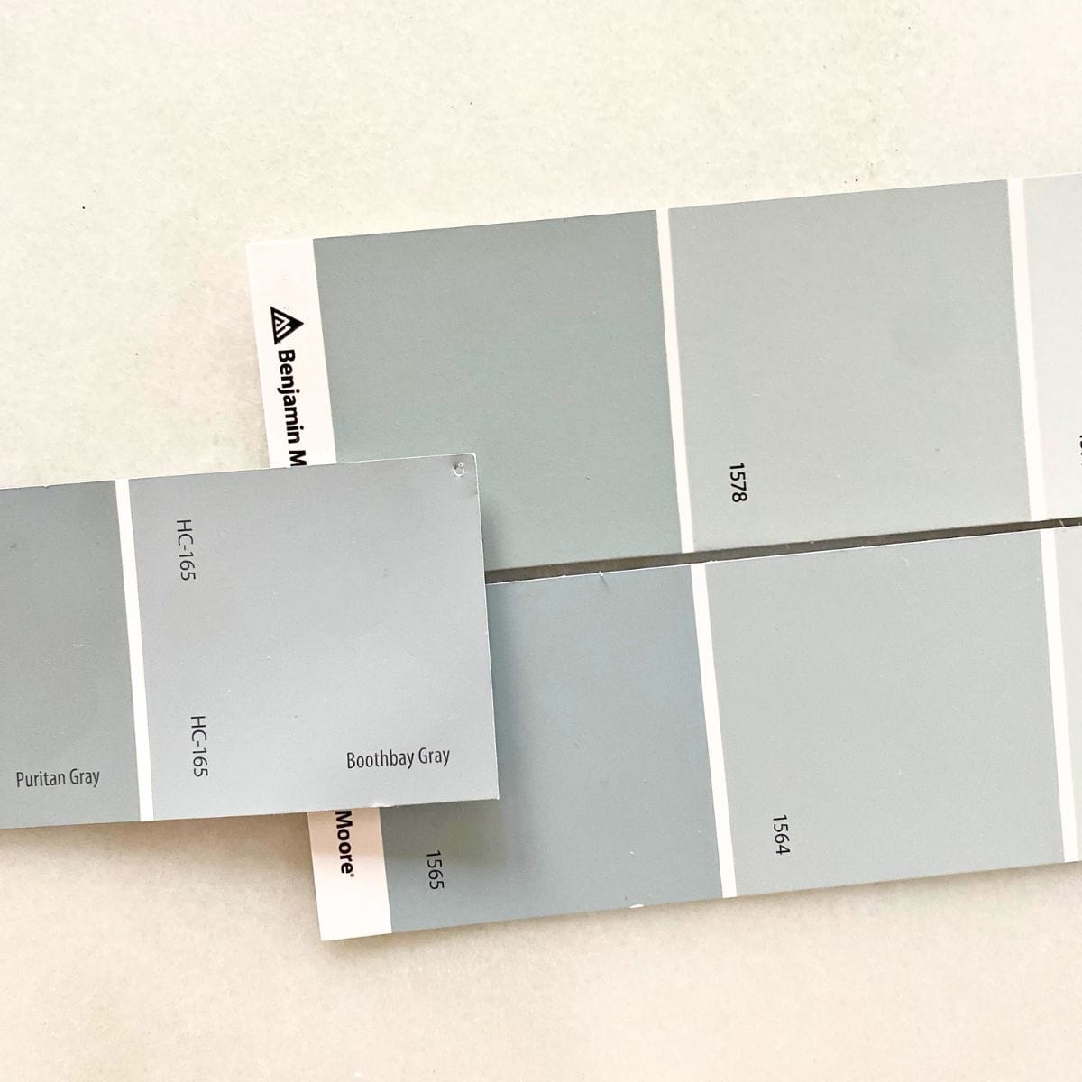
All these paints are a lovely shade of gray with hints of blue-green, a hue I absolutely adore.
In particular, Boothbay Gray appears quite blue in some lighting, gray in others and green in yet other lighting. One of my all-time favorite applications of Boothbay was a home designed by Mollie at Design Loves Detail. From the front doors to the nursery, it was the star of that home.
When comparing Greyhound (or Piedmont Gray) to Mount Saint Anne they are near indistinguishable. Once you compare them to Boothbay Gray, you will notice how deep blue-gray Boothbay Gray leans.
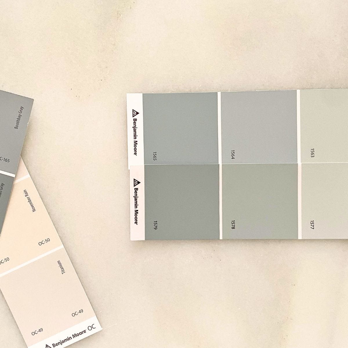
A calming green undertone reveals itself in Greyhound, while a blue undertone becomes more pronounced in Mount Saint Anne.
You almost can't go wrong choosing any shade here. Do you want more blue, green or gray? That's all you have to decide.

Kitchen Step Stool Makeover Reveal
Since this is not a how-to article, I won't go into detail about how I painted the kitchen stool. In general, it was a fairly painless process.
A couple things to know, though. I wanted the overall character to remain intact, so I did not sand, nor did I use a paint primer. Of course, I did give it a proper cleaning and removed any paint that was actively chipping off, but a rough texture was desirable as I will be standing on it.

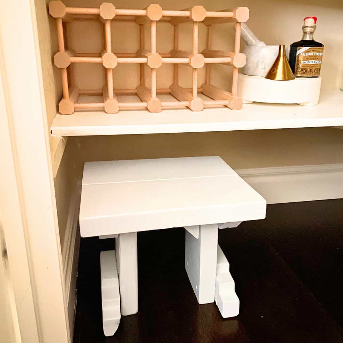
Two coats of Feather Gray were enough to fully cover all areas of the stool, including underneath.


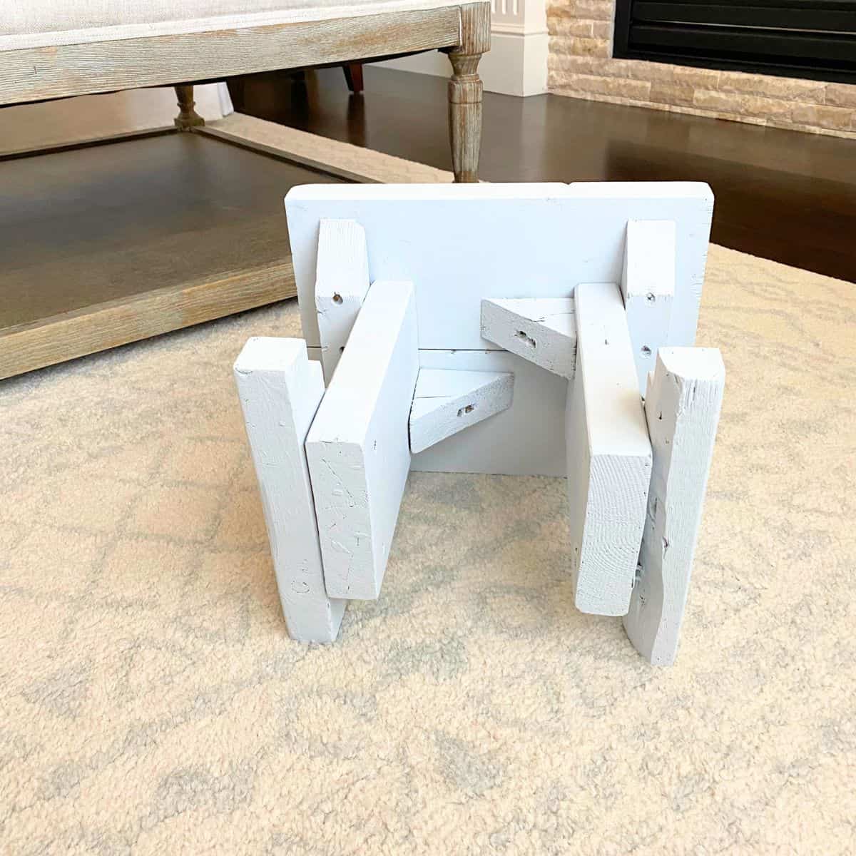
No, I did not have to paint underneath; however, I thought it would enable me to more easily pull the stool from under the bottom pantry shelf without getting splinters. (You'll remember I didn't sand it.)

Not a day goes by when I use this little kitchen step stool to grab something in our pantry that I don't think of this makeover. Such a small thing makes me so happy!
Ready to grab your paint and try it yourself? Go for it and tell us all about it in the comments!

Leave a Reply